
It's 2020, and by now, we have a few things we're certain of in the tech industry: people really like the internet, these same people access said-internet in a number of different ways, and the web as we know it has changed drastically and will continue to do so. Our responsibility at iSeatz as a loyalty tech company is to craft solutions for as many of these people as possible, a Herculean task if it weren't for a little concept called Responsive Web Design.
Coined in 2010, Responsive Web Design is even older than most people realize, with some websites exhibiting the early qualities of flexible layout as far back as 2001. Despite its lengthy tenure, though, Responsive Web Design still has to contend with the developer nemesis: the concept of Pixel Perfect.
Ah, Pixel Perfect: the ideal, the utopia, the no-pixel-out-of-place, rendered precisely where a loving, attentive designer intended it dream. When websites were static and only viewed on 800x600 resolution screens, this was less ideal and more of the norm. A designer would slice up images, and a developer would jam them into tables, andーMAGIC! ーa webpage.
Why is this now such a pipe dream? In short, the advent of smaller, larger, stronger screens upended the efficiency of this now-prehistoric practice.
For example, you may have started reading this on your laptop and got interrupted, so you're catching up on your phone during your lunch break. Maybe you're more of a tablet reader, or prefer a dedicated desktop monitor. Besides each of those devices being (many times, obviously) larger than each other, the resolution on each device is likely equally unique.
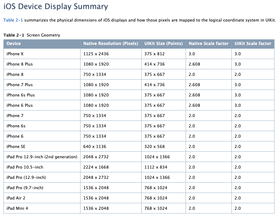
An iPhone could range as low as 640x1136 to as high as 1125x2426 depending on the model, and equal physical screen size doesn't always mean equal resolution. Just look at the iPhone 7 and the iPhone 6 Plus. Each uses the same UIKit of 375x667. Their resolutions, though? 750x1134 and 1080x1920 respectively.
Device, screen, and resolution size aside, it also matters what software the person uses. Every browser renders code a little differently; each has its own quirks and defaults that change how a person views a website. So, if you take however many internet-enabled devices the world contains, multiply that with the various size screens each has, times however many unique resolutions, then don't forget to include the number of different software that enables access to the internet because only then can you get the sheer scope of reach that your website could have and why it is impossible to control every pixel on every device on every screen in every resolution using any potential browser.
So, trust me when I say pixel perfect is a myth when it comes to web design and development, a happy thought from ye' old internet times gone by. Designing and coding a unique solution for every screen and having it look exactly the same is not only inefficient and expensive, it's downright impossible.
As our digital options increase infinitely, the only concept that sustainably supports the growth is responsive design and development because the ultimate goal of a great web experience is an solution that is accessible and familiar to users regardless of device, resolution, or software.